Research


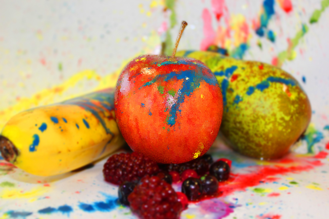
This is the direction that I have chosen to take for the product photography project. It is not the conventional product styled photo but I have picked colour because it offers a wider range of pictures that I can manipulate into a good vibrant image. It also invites the viewer to think more about the images - they are less obvious in their direction.
My Work
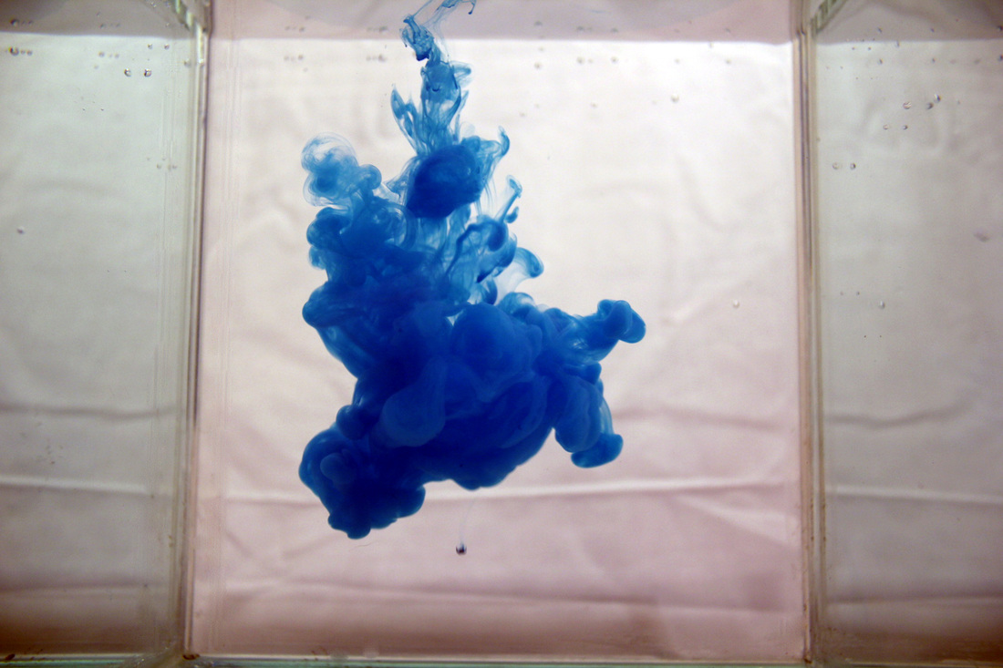
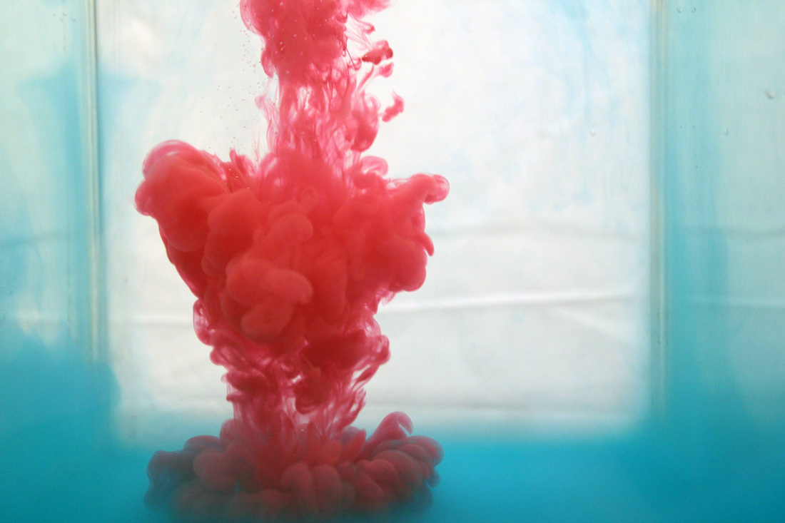
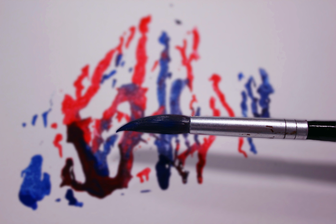
Original photographs


The colour on the original photographs are dull and washed out but taking the picture is sometimes half the effort of making a good picture. I will go into photoshop and edit the colour of the photo to bring out the deep rich colour that is there but is not obvious in these photos.
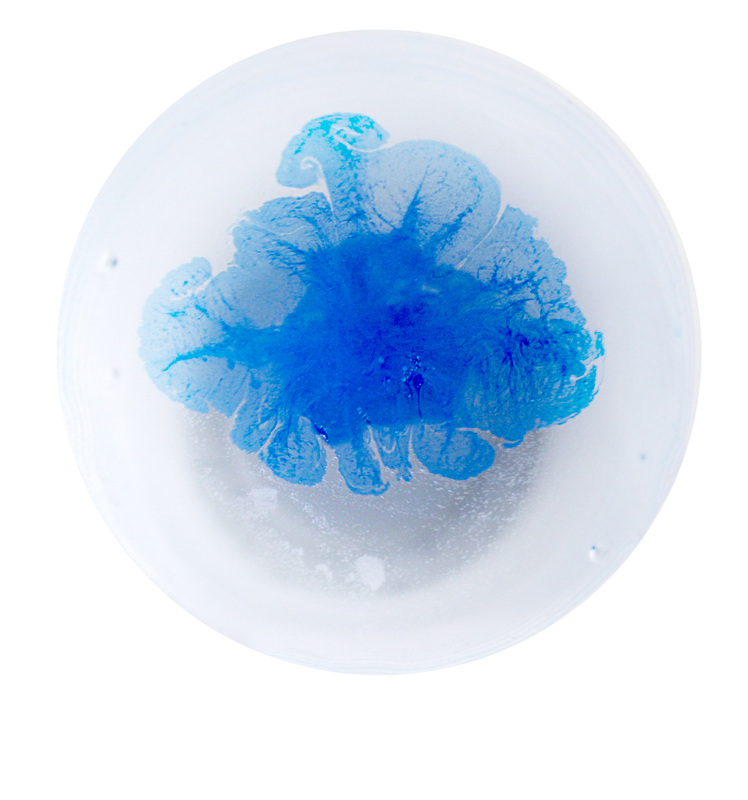
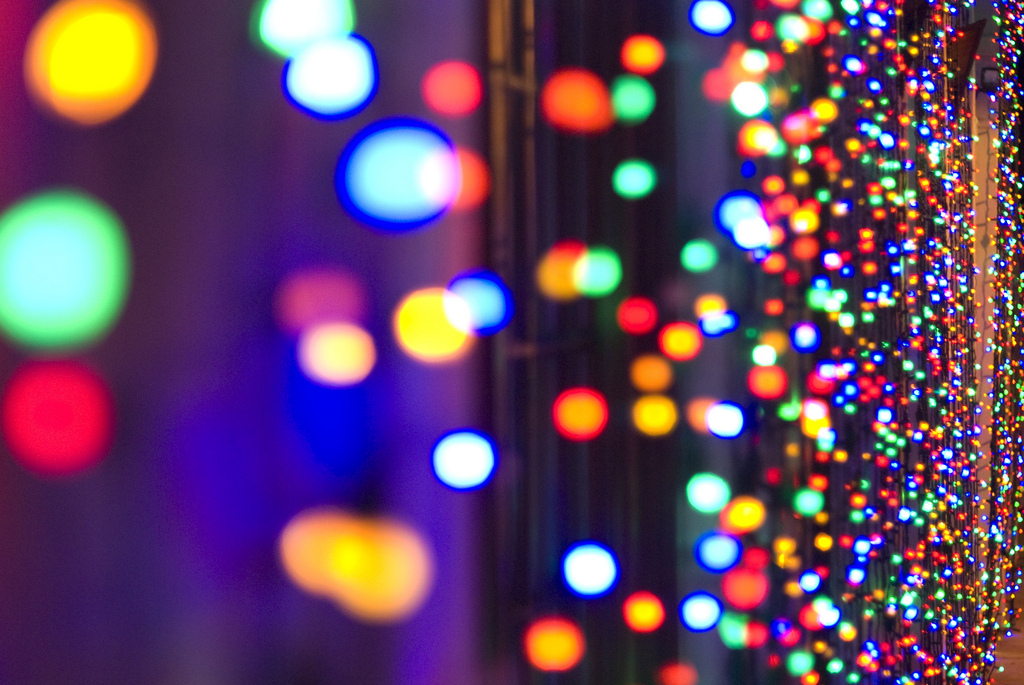
Photoshopped Photographs


The original photos were not that colourful, but they did have potential to have vibrant colours once I Photoshopped them to alter the saturation and colour balance them. Colour is all around us, it can change the mood of any situation and make something more interesting if it has colour. There are some many different varities of colour that can all do different job in a photo, such as the colour red. Red is a symbol of compassion and confidence, then there is the colour blue which symbolises relaxation and sustainable